Font pairings / Editorial
Cormorant Garamond + Nunito Sans
Explore the six-trait profile and scores ↓Less noise. More meaning.
Good letters give ideas room to breathe. They help us find a rhythm, bring what matters into focus, and tell a story in our own voice.
Click the text and make it yours.
Elegant
Why it works
Cormorant Garamond brings a serif rhythm to headings, while Nunito Sans organises paragraphs with simpler sans-serif forms. Their different constructions help separate headings from body text. Start at 48 px for headings and 18 px for paragraphs. This is a profile-based suggestion: judge it on your own content.
Learn how to judge contrast and roles in a pairing, then adapt the size scale to your layout.
Download both fonts and their licenses. The CSS paths are examples — adjust them to your project.
Find another pairingTHE MATCH / 6 PAIRING TRAITS
This pairing has a personality.
Same questions. Same scores. See how we match type.
This is the pairing’s profile. Answer six questions to see your personal match score.
Find my fonts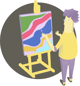
01 / WEIGHT 20%
Style
Why does it matter?
Think beyond colour. What feelings should your project leave behind? Warm and welcoming, or cool and matter-of-fact? Choose neutral if you have no preference.
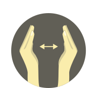
02 / WEIGHT 15%
Headline length
Why does it matter?
How many words will your headings contain? A short title leaves more room for expressive type. Longer headlines need a quieter rhythm and readable letters.
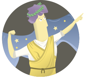
03 / WEIGHT 10%
Font familiarity
Why does it matter?
Would you prefer a familiar face, an occasional sighting or a less obvious discovery? This is an editorial estimate of familiarity, not measured internet usage.
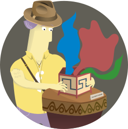
04 / WEIGHT 20%
Type of content
Why does it matter?
Content sets the tone. Professional projects need credibility and composure; a casual story can make room for more personality. What character does your content have?
05 / WEIGHT 20%
Headlines
Why does it matter?
Should a headline primarily communicate, balance clarity with character, or decorate the page? This helps us decide how expressive the heading typeface should be.

06 / WEIGHT 15%
Taking a chance
Why does it matter?
There is a land of unusual typefaces below. Would you jump? Tell us how far we can go, from quiet letters to a bold, unexpected personality.
How are the scores calculated?
For each selected answer we read its compatibility points from the pairing matrix. Mismatch is 100 minus those points. We square each mismatch and multiply it by the question weight. We divide the sum by the total active weight, take the square root and subtract it from 100. A distinctly weak trait therefore matters more than it would in a simple average.
score = 100 − √(Σ[weight × (100 − points)²] / Σ[active weights])
Base question weights: 20, 15, 10, 20, 20 and 15. Neutral style means no preference: we exclude that trait and renormalise the remaining weights. Its 100 matrix points are not a bonus. The result is a matching heuristic, not a probability or font quality rating.
Pairing profiles combine heading traits (80%) and body traits (20%); content type uses a 60/40 blend. Familiarity is an editorial estimate. Required characters for the selected language and a pinned font are filters applied before ranking.
We sort by full-precision scores and display one decimal place. Identical point profiles are grouped. From the remainder we choose up to three suggestions with different headings, unless a heading is pinned. Exact ties are ordered by ID; that does not imply an aesthetic advantage.
A suggestion derived from style profiles. Judge the final composition on your own text.
Learn more
A good pairing starts a design
Explore what makes two fonts work together and refine their proportions with the type scale guide. The brand collection offers more directions to compare.